ANALYTICAL PHASE
brand analysis
moodboard
communication strategy
DESIGN PHASE
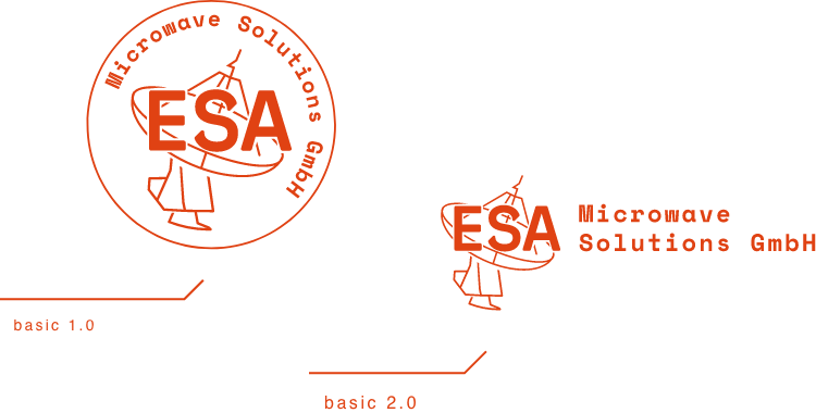
logo design
creating new SIW
design of jobbing prints
design and typesetting of promotional materials
PRODUCTION
DTP production + overseeing printing
ESA-ms is one of the largest suppliers of microwave feed systems for ground station antennas. Sounds serious? Luckily, the team behind this brand are not only first-class professionals in the technological arena, but also people with a great eye for design and aesthetics. Thanks to this, we were able to create an identity and website which we are incredibly proud of.
The brief included creating a new visual identity for a company which has been active on the German and European markets for years.
We decided to opt for bold form and strong colours, and direct references to style features from the Space Race era.

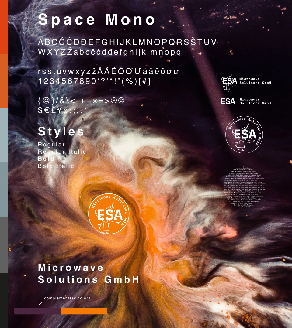

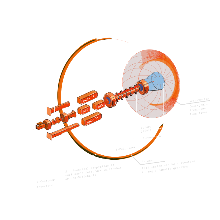
We chose add hand-drawn illustrations to the informational materials about the company, in order to add an “artistic” twist to the whole.
At the same time, we suggested a very “technical” typeface, reminiscent of descriptions which might have come straight from a space station.
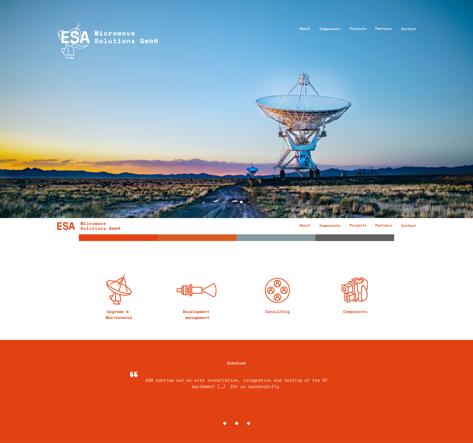
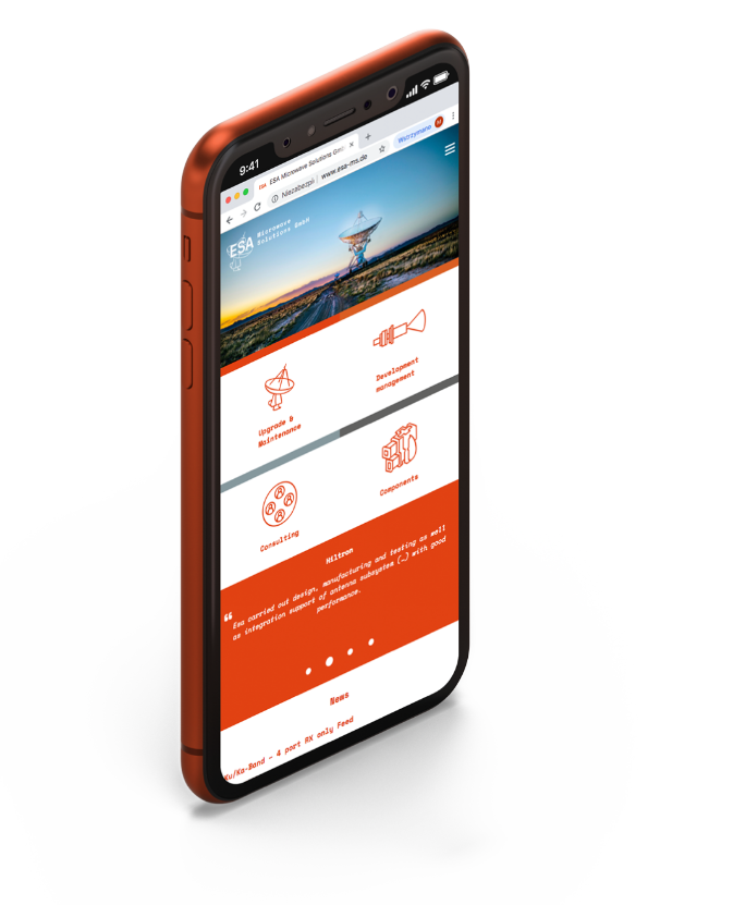
An important component of the visual identity was the webpage, which had the aim of explaining ESA itself and its range of activities to a wide audience.
Here, we also emphasized clarity and readability in the message, breaking it up only with a spectacular photograph on the home page.


brand analysis
moodboard
communication strategy
logo design
creating new SIW
design of jobbing prints
design and typesetting of promotional materials
DTP production + overseeing printing